Led UX research and design
 for a campus app that helps students find nearby spots and unlock student-ID discounts.
Students often miss the discounts and local spots right next to campus. This project shows how I led CampusTown from research to high-fidelity prototype, covering user interviews, information architecture, and interaction design in Figma.
- Jan - Apr 2025
- Timeline
- Lead UX Designer/Researcher
- Role (Team Size: 4)
- Hi-Fi Prototype
- Deliverable
Designed with:

Overview
Small Businesses Want Students. Students Can’t Find Them, Or Their Discounts.
As out-of-state students on Northeastern’s Oakland campus, we were new to the area and wanted an easier way to explore it. Over a 4-month semester in our Entrepreneurship & Innovation class, our team of four designed a community-driven local discovery app.
Problem: Most colleges fail to highlight local businesses offering student discounts within off-campus resources
Student discounts are a popular topic, especially among new-admit students such as first-years and transfers. Despite this, colleges only include popular chain stores that are already known to have discounts, excluding local gems and discouraging local discovery.
Opportunity: Local businesses drive discovery for students new to the area
When students call a new place home, they are looking for the locations that set it apart from the rest: the local gems and mom-and-pop shops that give a city it’s character. Creating a resource featuring local gems and where student ID is accepted will:
- Encourage Local Discovery
- Highlight Local Businesses and Drive Student Consumer Base
- Help students take advantage of student benefits
Design Solution
Introducing CampusTown: Your Student ID, Your Guide To The Best Local Spots.
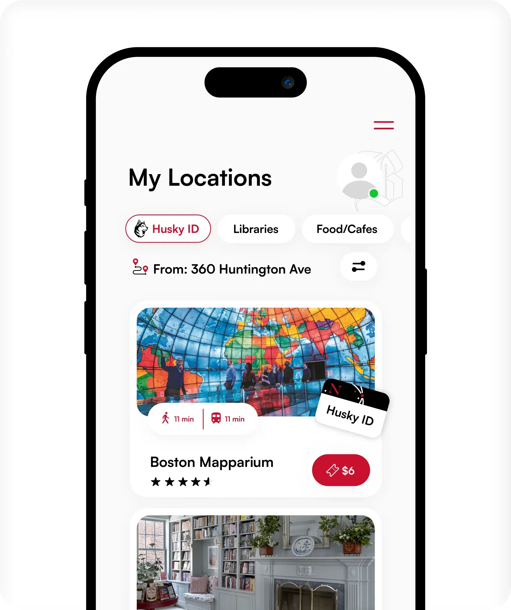
A local discovery app that guides students to nearby businesses, cafes, and attractions, and shows where their student ID saves them money.
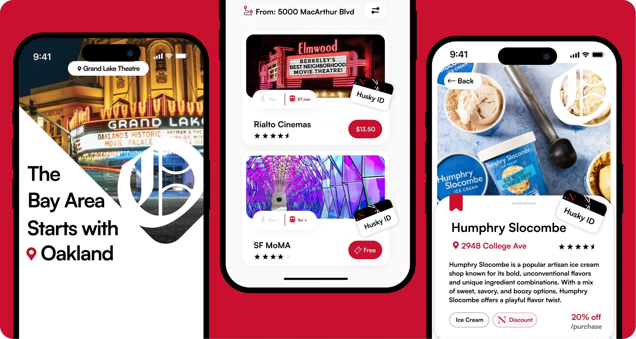
Every Campus, Its Own City Guide.
CampusTown adapts to college campuses across the U.S., so students everywhere can explore what’s around them.
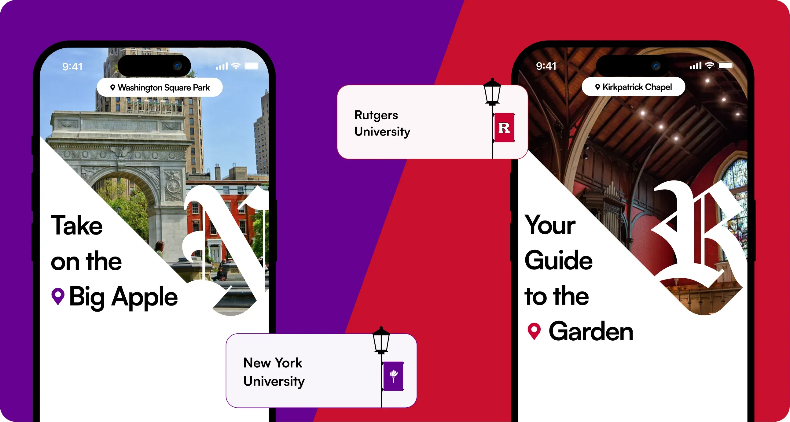
[Concept Screens for NYU and Rutgers University]
Core Flows
Prominent Screens That Define The Experience

Personalized Landing Screen
Background image reflects the city of the user’s college campus
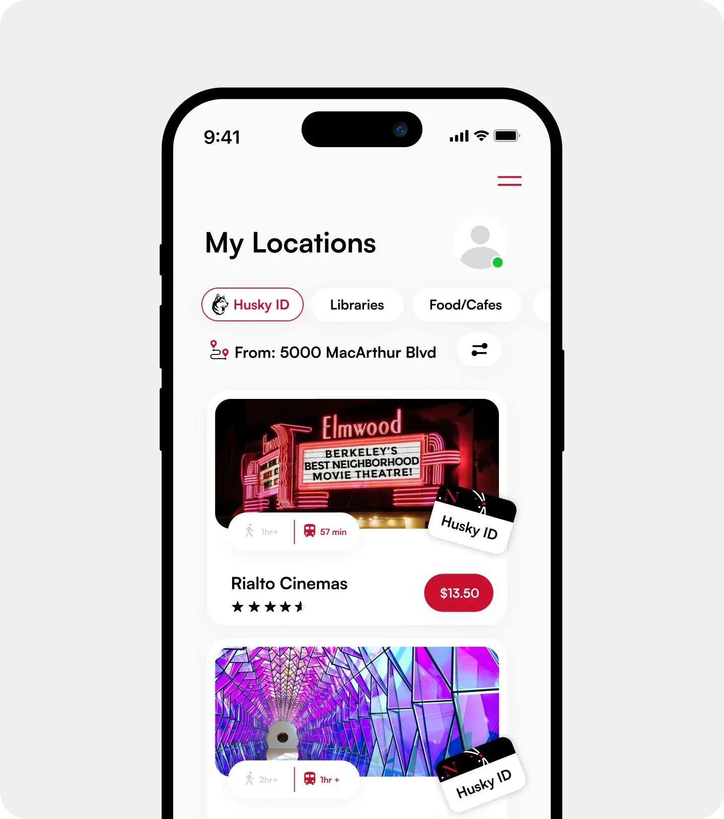

Explore The Local Gems Everyone Raves About
Filter locations based on Student Discounts, Category, Distance, and more
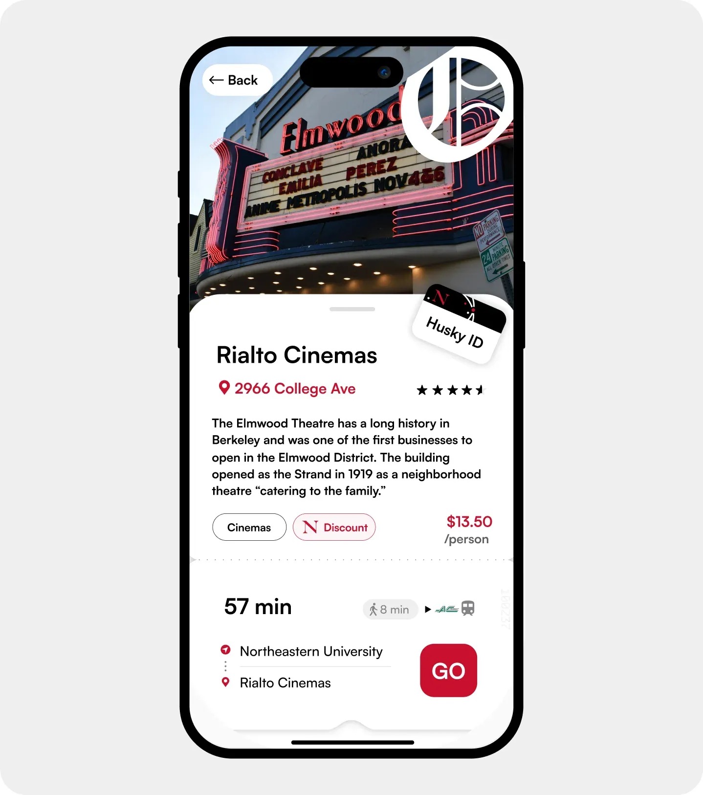
Tell Me More
Learn more about the location, it’s discounts, estimated cost, and get real time travel info
See What Your Peers Think
Location rating allows students to rate their experience for others to see
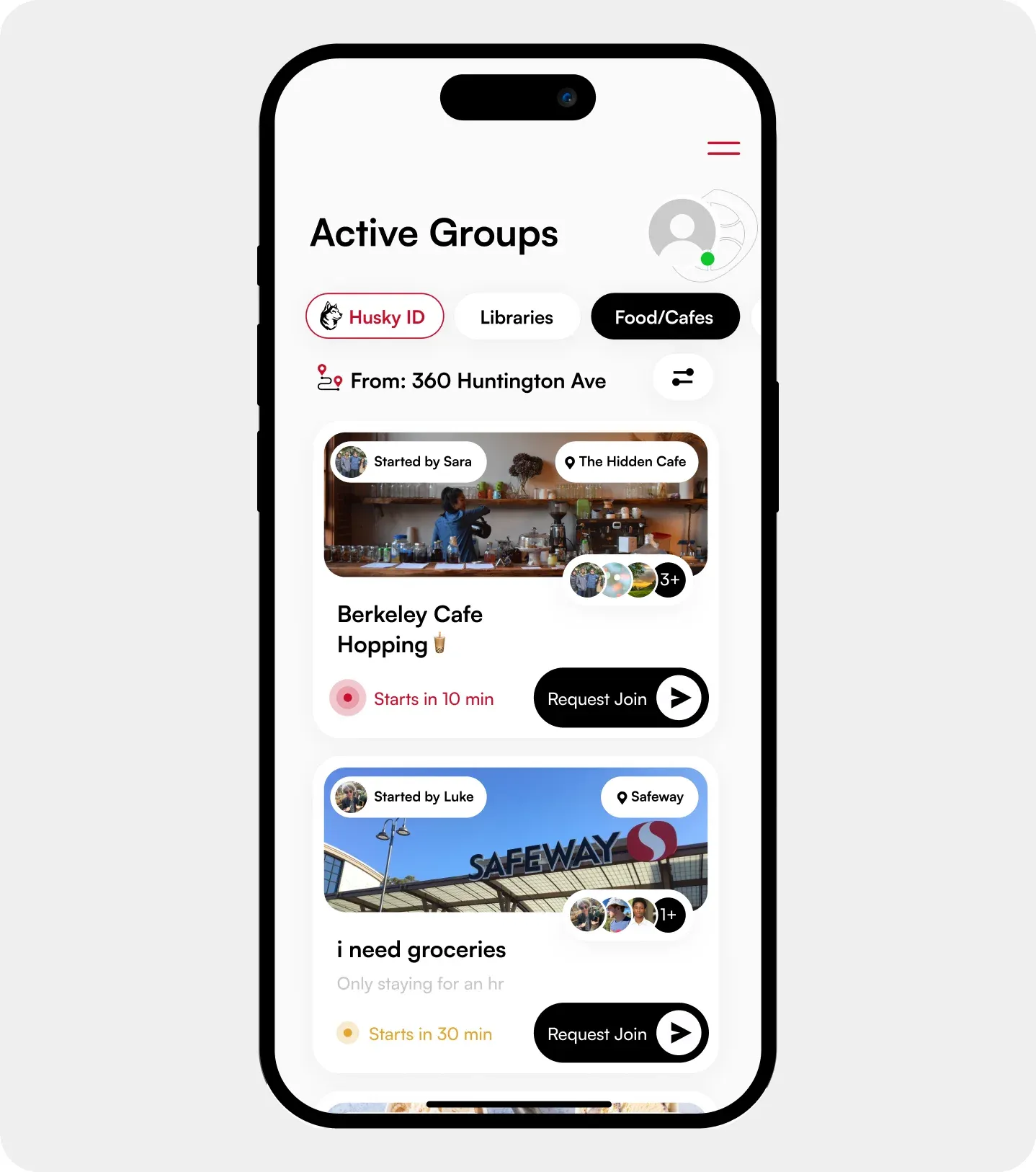
Exploring is Better Together
Students can create or join exploration groups with peers
Research & Local Business Owner Interviews
Understand The Needs Of Our Stakeholders: The Students And The Businesses
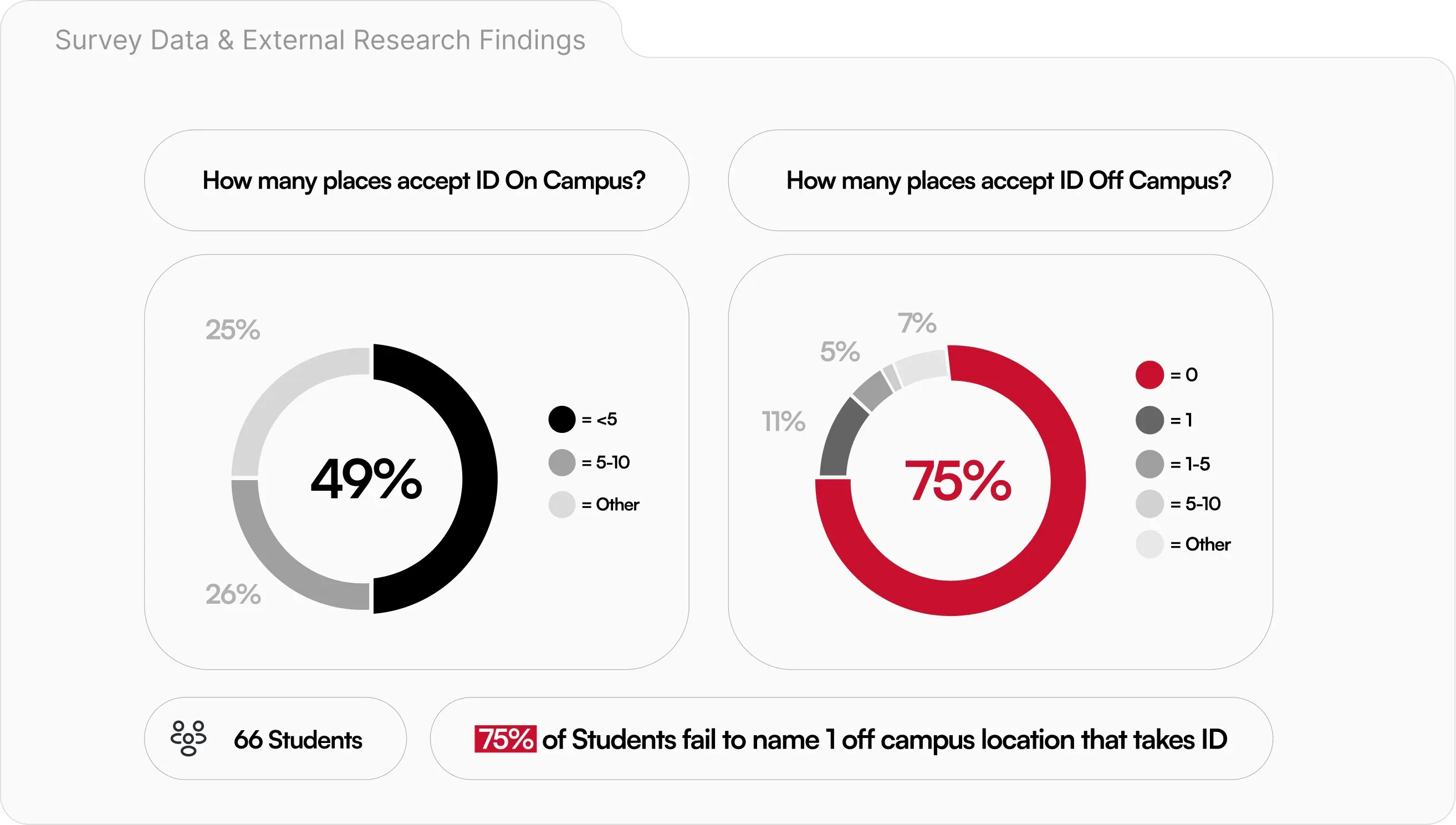
During our second month of the project, we conducted surveys among our on-campus peers, prompting them to reflect on how well they know about student discounts and the resources available to them.
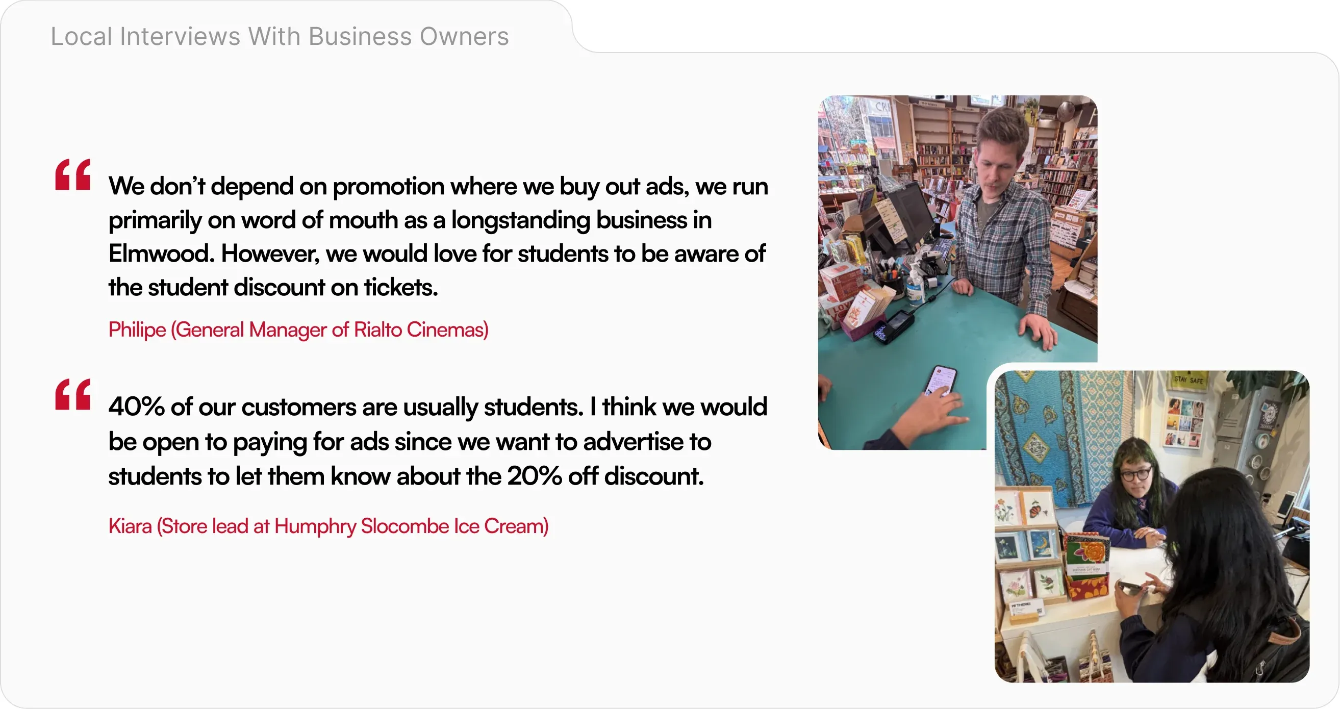
With student insight, we traveled to local communities in Oakland that are home to many locally owned businesses. We showed them the resources currently available to students that exclude local businesses, and asked them what they would want in a digital solution.
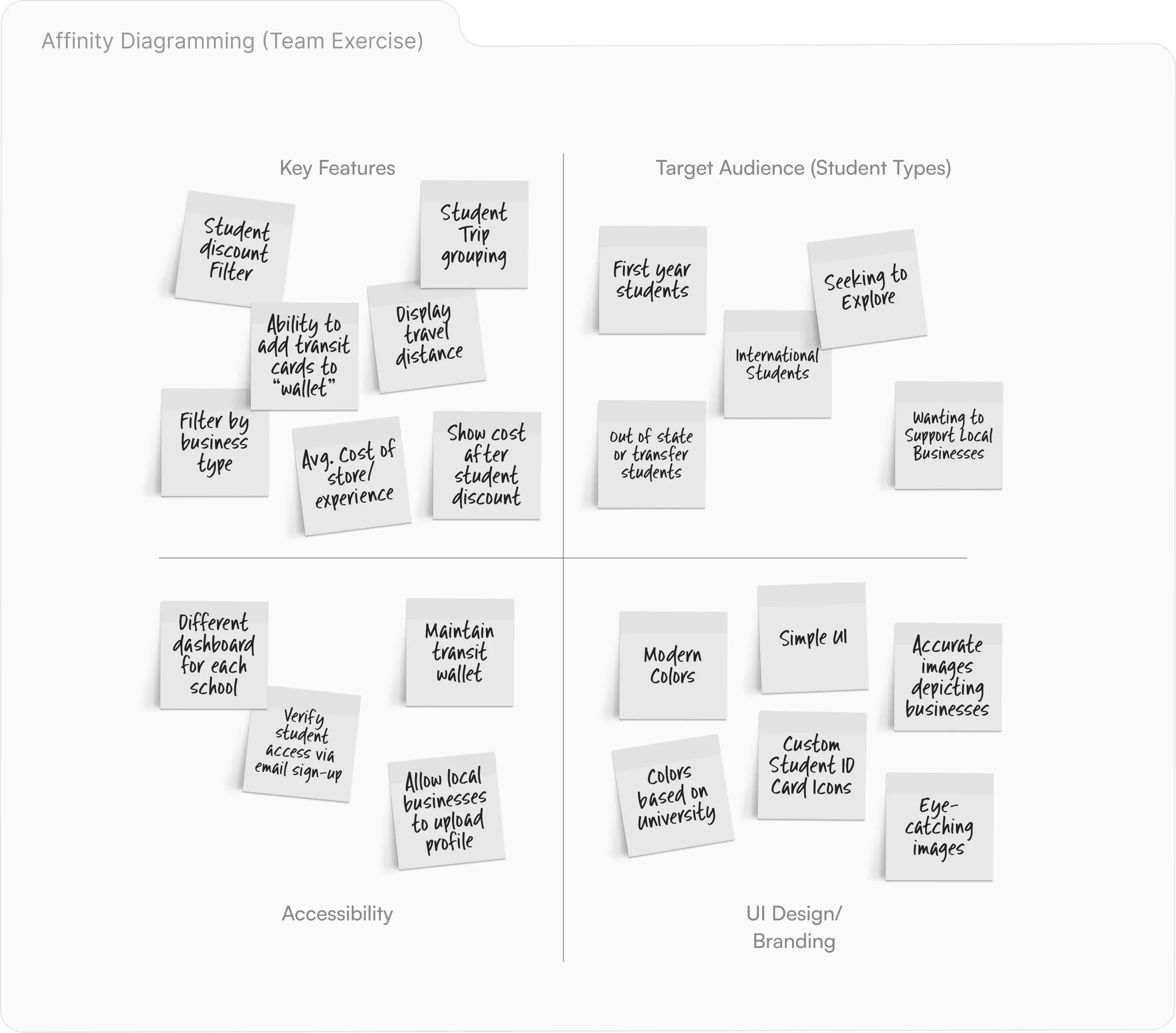
Next, we compiled the findings and insight from our stakeholders in the form of an affinity diagram, documenting our primary userbase, key features, and product considerations.
Prototyping & Testing
Turning Research Findings Into A Working Product
Referencing our Affinity Diagram, our team practiced card sorting as a key technique to rule our vital features, “Nice to Have” features, and features that would hinder the user’s experience.
Card Sorting:
Must Have
- Markers for Student ID Acceptance
- Location Category Tags
- Community Feature
Nice to Have
- Embedded Transit Info.
- Image Carousel on Loading Screen
Won’t Have
- Focus on Chain Locations
- Upload Video Content of Locations
- Horizontal View/Dark Mode
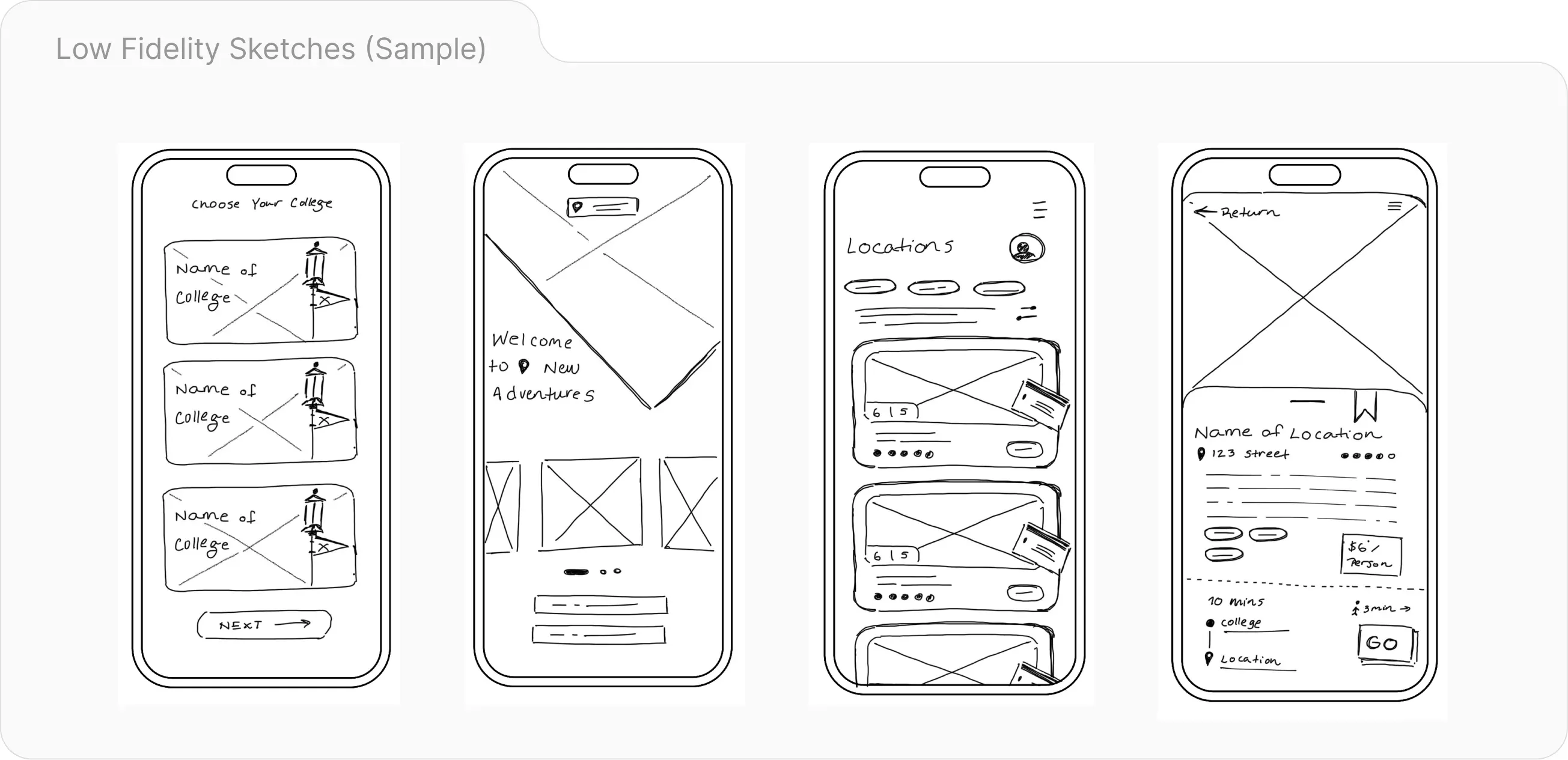
As the lead UX designer, I consolidated our card sorting, diagramming, and ideation into low-fidelity sketches that I later brought to a team meeting for critique and suggestions.
Design Decisions
How Prototype Walkthroughs With Students Shaped The Final Design
Insight 1: ID & Transit Cartridge
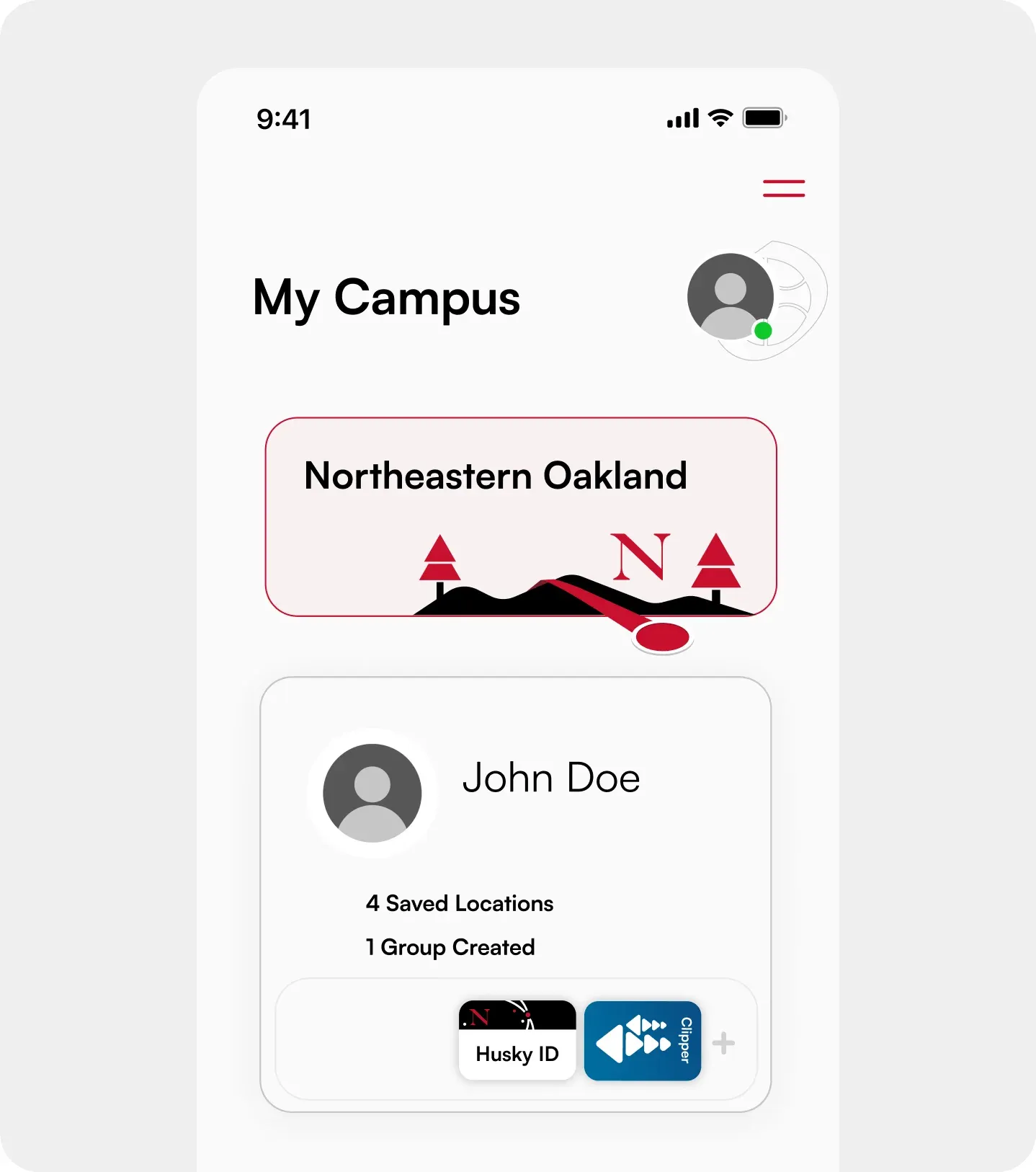
After interviewing students on the Oakland Campus of Northeastern, one tester noted that the user profile page should include icons of the id cards a student has registered, namely their student ID and transit card (ex: Bay Area Clipper Transit Card) to help better inform transit decisions.
Insight 2: Sorting Community Groups By Time Posted
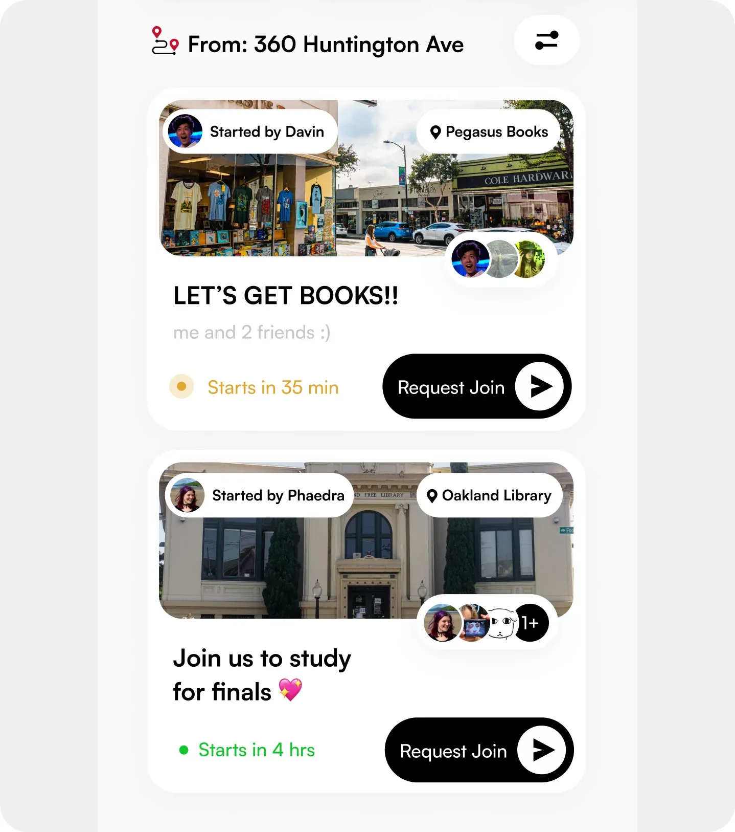
One student commented that the main feature they hate about student group apps is the inability to tell which groups are still active. As a result we designed time markers with color coded radar icons.
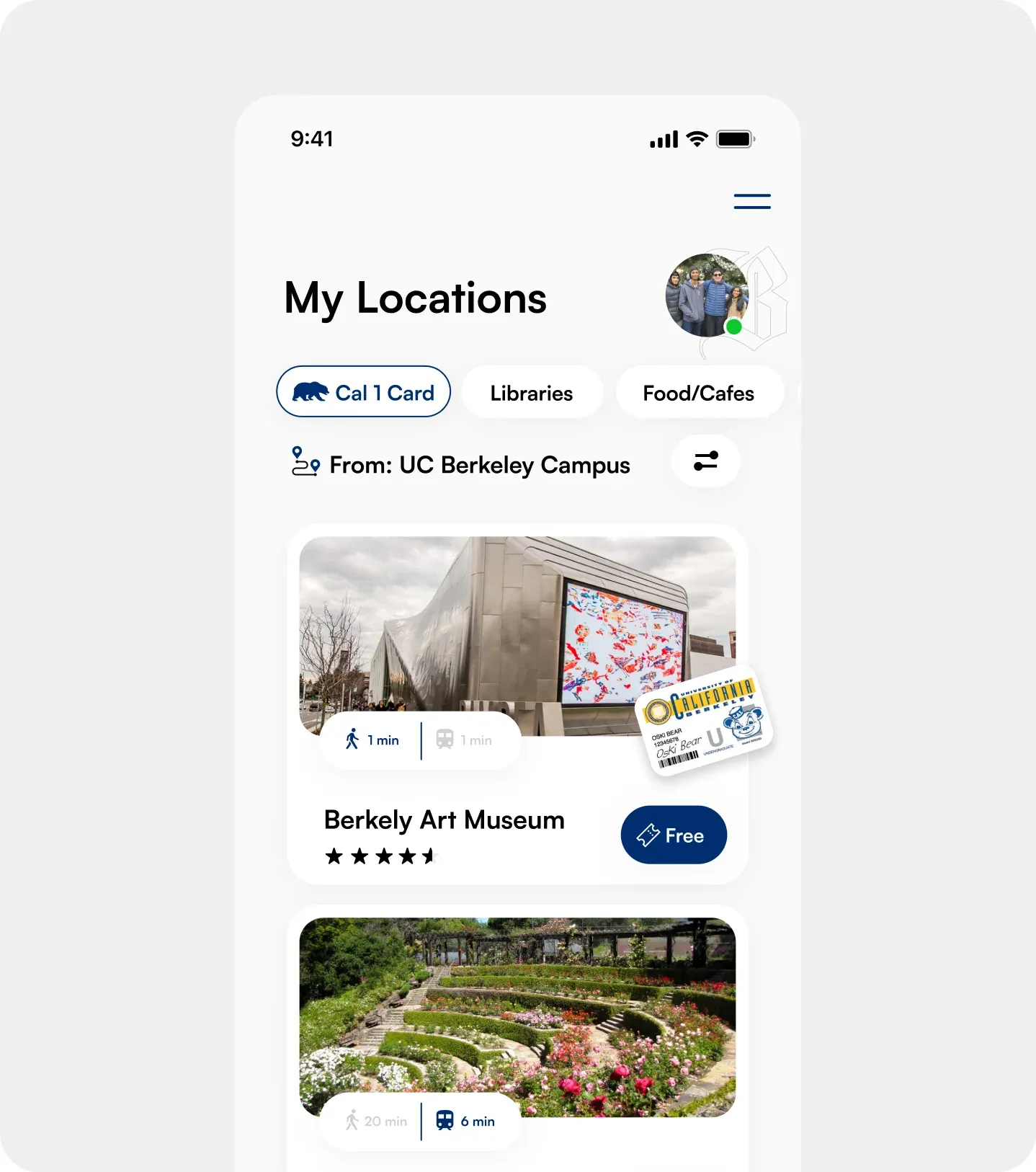
Insight 3: Adopting School Specific Iconography
Interviewing a UC Berkeley freshman, we discovered how big of role personalization can play for the user. As a result of their feedback, we added mini versions of student-ID cards as markers for businesses that accept student discounts.
Reflection
What I Learned
Stakeholder Insight Is Vital
Surveying over 60 students and conducting in-person on-site interviews with local business owners without a doubt shaped our experience from end-to-end for the better.
Prototype Walkthroughs Help Inform Design Decisions
Our prototype went through roughly three full iterations before we arrived at our final product. What informed these UI and usability decisions were our prospective users (students) who told us what they liked/disliked about features and provided a direction for improvement.